Rangers breaking in alternate gloves

Advanced Member


Posted 13 November 2023 - 04:13 PM
I hope they do them for the game and not just warmups. what was Philly's complaint years ago? they slid too easily when players went down?
When the Flyers had theirs last year with the RR2 program, they were only for warmups. Seeing as the Canes also showed images with pants/socks, I'm going on a limb and assuming it'll be the same.
I think it was they slid too fast on the ice and they didn't breathe well.
That's what I recalled as well
Posted 13 November 2023 - 04:14 PM
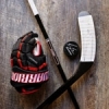
I love tan gloves, but the bright sky blue wordmark on the cuff rolls completely ruins these gloves IMO. The goalie pads in those photos are sweet tho!
Posted 13 November 2023 - 09:38 PM
Rangers breaking in alternate gloves
Are those... Supreme Mach gloves with Vapor cuffs?
Not that I blame him for swapping them out. The Mach cuffs kinda suck.
Posted 13 November 2023 - 10:14 PM
Ya, I feel like I saw that a couple times in games but not as clearly as this picture. Vapor pro cuff on the Mach gloves.Are those... Supreme Mach gloves with Vapor cuffs?
Not that I blame him for swapping them out. The Mach cuffs kinda suck.
Posted 19 November 2023 - 06:18 AM
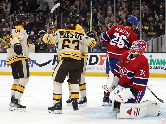
The Bruins pants last night vs the Habs were so nice.
Posted 20 November 2023 - 03:14 PM
Agreed. I'll go a step further and add that they should make their anniversary logos permanent as well. The "B" pops a lot more without all of the busy outlines. The serifs that were added in 2007 can stay, though.
Posted 20 November 2023 - 03:42 PM
Canucks are wearing matte buckey's with their black thirds now.
Love 'em
https://www.instagra...zRlODBiNWFlZA==
Formerly AussieCanuckHockeyLover
Posted 23 November 2023 - 09:03 PM
Agreed. I'll go a step further and add that they should make their anniversary logos permanent as well. The "B" pops a lot more without all of the busy outlines. The serifs that were added in 2007 can stay, though.
Posted 25 November 2023 - 05:22 AM
Posted 25 November 2023 - 11:11 AM
Formerly AussieCanuckHockeyLover
Posted 25 November 2023 - 01:54 PM
I don’t hate them, but they’re not a barber pole design; they just have two sets of stripes. Really wish they would have added 2-4 more stripes for an actual barber pole. Like the hit of red on the gloves. They’re getting the most they can out of that damn crest design, geez.
Better than Vegas though, that’s for sure
Posted 27 November 2023 - 08:56 PM
Posted 27 November 2023 - 10:25 PM
That can’t be the final gloves/pants. The socks had no stripes.
Posted 30 November 2023 - 02:38 PM
Kid Coyote mentioned this recently, but it does look like CCM made a subtle tweak to their new logo. It still looks bad, but is definitely 'less bad'.
Super Tacks 'BOLD' logo
https://www.ebay.com...:Bk9SR8yZyJuEYw
Super Tacks 'not bold' logo
https://www.ebay.com...:Bk9SR8yZyJuEYw
Not sure if this should be here or in the eBay thread. Kind of fits both topics, but figured it was more a sighting
Posted 05 December 2023 - 02:35 PM
Custom everything.
Posted 12 December 2023 - 01:10 PM
Late to the discussion here, but frankly, I never liked the CCM logo they rolled out in 2007. I used to be one of those weirdos who frequented free font websites and noticed that the new logo bore a strong resemblance to a tawdry-looking font called Demonized. Removing the pointed serifs makes it look even cheaper.
If I were in charge of the company, I'd find their current graphics designer, slap his hands away from the editing desk, give him a coloring book, and then find someone who could take the '70s-2007 logo and modernize it.
Donezo. Where is my obscenely large sack of money?